20+ exit points on a Google Play listing page
This is one little trick that will increase the installs of your Android app/game when users reach the Google Play store, as it will prompt the install window pop-up instead of showing the program details page.
Are you an app developer? I can help you promote your app/game by submitting app review requests to 140+ Android review sites, details here: 140+ App review requests submission
It works only when you are sending out users to the Google Play Store listing of your app/game. By default, if you send users to the details page they will see the product details, screenshots, reviews and so on. Lots of exit points for your possible user, as they can change their mind and decide not to install your app if they spend too much time on page or if they click on external links. You can see in the image below marked with red the possible exit points for a regular Google Play listing:
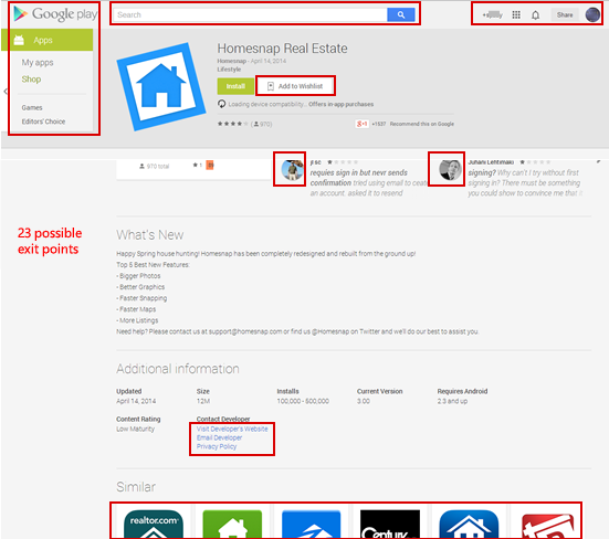
Possible exit points for an app
For an app that has at least 4 reviews there are a minimum of 23 exit points:
- In the header part alone, there are the navigational links under the Google Play logo (6 in total if you count that the logo is clickable too).
- The search bar along with the account information on the right (at least 3 possible exit points).
- Google+ icons of reviewers, as those link out to G+ (at least 4 of them if you have that many reviews). That if you don’t count the “Write your own review” link and add to wishlist which can postpone the install decision.
- The similar apps, which are links to competitors (around 6 of them), plus the developer contact links (which still can postpone a decision). If the developer has other apps, those are exit points too.
For a regular product listing page, these will decrease installs and reduce conversions. So how do you solve this and improve conversions for app installs?
Increase conversions by forcing the install window
As you can see, lots of possible exit points for your users. However, if they decide to give your app a try they will click on the Install button (if the app is free, that is) and then they will see an inpage pop-up window. This window is better because it only has 2 exit points: if the user clicks on the Cancel button, or if the user clicks anywhere outside of the pop-up window as you can see below:

Just 2 exit points in the popup window
You see where I’m going now? If you could send your possible users to the second page, the one where they have only 2 possible exit-points instead of 23 exit-points, your app installs will increase. Because it’s a known fact that conversion increases with the decrease of possible actions. If on page A you have 23 buttons and only one main action you’re interested in, you’ll have a poorer conversion than on page B where you have only 2 buttons (one being the main action).
The only problem is that Google Play doesn’t let you show directly the in-page popup window. Or does it? I discovered that by adding a simple parameter that has as a value your package id, the popup window is shown directly to the user.
Here’s how the regular URL looks for a Google Play listing (eliminating other parameters for language and tracking as they’re irrelevant here:
https://play.google.com/store/apps/details?id=com.homesnap
Here’s how you can force Google Play to show the inpage pop-up window:
https://play.google.com/store/apps/details?id=com.homesnap&rdid=com.homesnap
I bolded the rdid parameter that actually invokes the pop-up window. Voila, if you add this parameter to your Google Play link, now you can send users directly to the product page with the install pop-up opened and ready for them to click on that green Install button. If your app is paid, it will show the Continue button for them to finalize the purchase.
This works if they are logged into Google Play. But what if they aren’t? Well, here’s what it will show if they aren’t logged in:
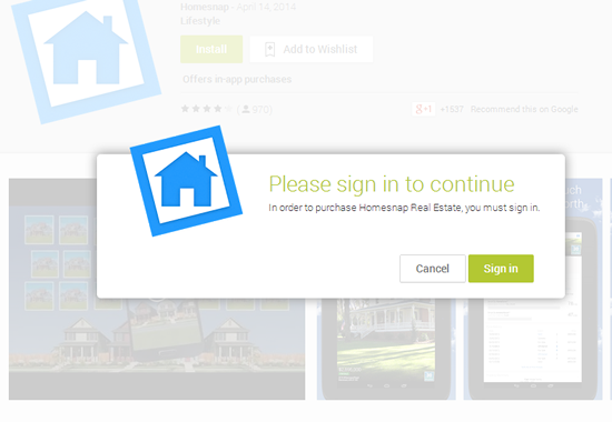
Popup with login button
It actually helps you because it forces them to sign-in and when they’re signed in they will still see the install popup page. Again, it helps conversion by reducing the number of steps your users have to do to install your Android app.
I’d be more than happy if you shared your results here on how this trick increased your conversions, or why not any other feedback you have.

